
Designing with Light, Perfecting with Colour
It's not really Christmas that marks the return of the light for me — it's the clocks changing at the end of March. Suddenly evenings stretch out, rooms glow for longer, and everything feels a little more hopeful. I'll admit to being slightly obsessed with daylight — its disappearance, its return, when there's too much of it and when there's not enough. The longer I do this job, the more I notice how completely light shapes the way we experience a home. It doesn't just affect mood. It genuinely changes colour.
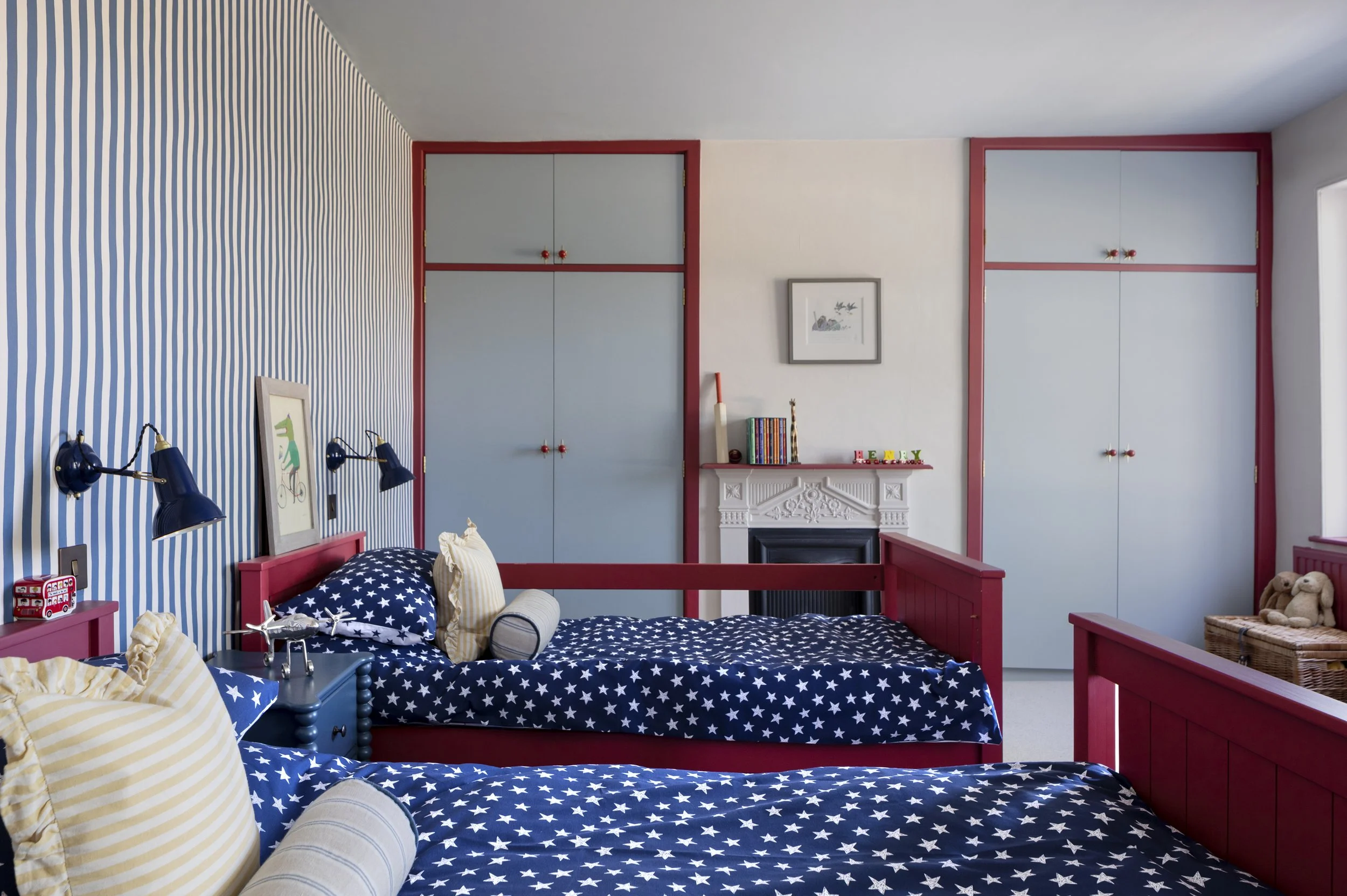
Watch a single painted wall across one day and you'll see it for yourself. Morning light makes it feel crisp; midday reveals its true depth; by evening it can take on an entirely different character. The paint hasn't changed. The light has.
Go all in. Colour drenching — painting walls, ceiling and woodwork all in the same shade — was one of the most talked-about interiors trends of last year, and reactions to the idea tend to split people down the middle. I'm firmly in the "love it" camp. Done well, it softens a room, blurs the hard edges, and makes a space feel calmer than you'd expect — often the opposite of overwhelming. And with the range of paint brands now offering genuinely considered colour palettes, it's never been easier to try.
Step away from bright white. If full drenching feels like too much of a leap, woodwork is a gentler place to start. The 1980s left us with a habit of painting every skirting and architrave in a stark white — a far cry from the Georgian tradition of dark, grounding woodwork tones. I'm not suggesting a wholesale return to brown, but a deep green, inky blue or rich oxblood on skirtings can transform a room on its own.
Lean into the light you actually have. Let your room's real light levels guide the colour, rather than fighting them. A dark, north-facing room rarely benefits from being painted pale in the hope of brightening it — lean into what it naturally wants to be instead, with a deep, cocooning shade that suits a bedroom, study or snug. A south-facing room flooded with warm light can handle brighter, more confident colour than the same navy that looks so chic on a paint chart but turns heavy in direct sun.
Let rooms talk to each other. A home isn't a showroom, and there's no rule that every room needs to match. Think about how the colour in one room leads into the next — a deep tone giving way to something softer, or two shades that quietly complement one another as you move through the house.
As the light returns this spring, take it as your cue to experiment. Watch how your own rooms shift through the day, and trust what you notice.
This piece originally appeared in Alicia's monthly interior design column for Essex Life, March 2026.
Alicia Mellish leads Studio Forty Seven, an interior design studio working across Essex, Suffolk and Norfolk.